CI Identity
The brand identity of Lian Global Logistics
Lian Global Logistics
Global Forwarding, Connected
CI PHILOSOPHY
Philosophy
The Connecting Line, The Value of Trust
연결하는 선, 신뢰의 가치
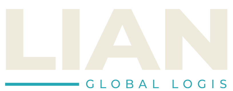
LIAN's Corporate Identity embodies the value of connection. The bold, outline 'LIAN' symbolizes transparent and reliable logistics, while the cyan line at the bottom represents swift, accurate global flow across sea and air.
The brand voice balances trust with momentum — a steady silhouette anchored by a single, fast-moving stroke.
LOGO SYSTEM
Logo System
Primary Logo
Standalone wordmark — recommended for solo use
Full Signature
Preferred application — wordmark with cyan line
COLOR PALETTE
Color Palette
Primary
Deep Ocean Cyan
Connection & Speed
#00BCD4
CMYK 80/0/20/0
RGB 0/188/212
The signature color — capturing the swift, precise flow of global logistics across sea and sky.
Secondary
Ship Hull Black
Trust & Gravity
#1E0A0A
CMYK 70/60/50/90
RGB 30/10/10
Used for typography and key text to deliver a grounded, trustworthy message.
Support
Cloud Grey
Clarity & Flexibility
#E6E6E6
CMYK 10/10/10/0
RGB 230/230/230
A neutral support color that creates breathing room and balance.
APPLICATION
Application
Lian Global Logistics
lianlogis.com
Business Card
명함
Envelope
봉투
Container
컨테이너
Need a Logistics Partner?
Our logistics consultants will propose the optimal solution for you